The NC Department of Public Instruction (NC DPI) released school performance grades in September, and an update of previous maps in the Consider It Mapped series on the topic reveals that the overall distribution of As, Bs, Cs, Ds, and Fs is similar to last year’s, even with changes to the measures included in this year’s formula.
Former features on Consider It Mapped covered grades from the 2013-14, 2014-15, 2015-16, and 2017-18 school years and the controversy over the equations used to derive the grades.
A quick primer before we dive in
The following is our quick primer from last year explaining the school grading system in North Carolina, with a few amendments:
- NC DPI reports school performance grades annually. Reporting of A-F letter grades began in 2013-14.
- Academic achievement, including measures of student progress like test scores (ex. End-of-Grade, End-of-Course, and ACT test results), graduation rates, and measures of work readiness, makes up 80% of a school’s grade. School growth, measured by the extent to which students met or exceeded the state’s performance expectations for that school for that year, makes up the other 20%.
- NC DPI reports grades on a 15-point scale. Original legislation was written with the intent to establish a 10-point grading scale, but this year, lawmakers made the 15-point grading scale permanent with Session Law 2019-154 (Section I).
- The way that NC DPI calculates grades changed again in 2018-19. Changes encompassed adding, removing, and combining variables, and adjusting guidelines for student-level analyses. This Communications Webinar released by the NC Department of Public Instruction along with the school grades this year gives a high-level overview of the changes. Because of minor and major adjustments to the formula year to year, this year’s map only displays data from the 2018-19 school year to avoid false comparisons to prior years. While comparisons may provide perspective at a high level, users cannot assume a one-to-one relationship regarding increases or decreases in school grades between 2018-19 and all prior years.
- Lastly, NC DPI added new variables to their data release this year, including the number of days schools missed due to Hurricane Florence (for some it was upwards of 20 and NC DPI made adjustments to school grades to account for the loss of educational days), and the percentage of Economically Disadvantaged Students (EDS). Long-time readers may recall that we used percentage of students opting into the free- or reduced-price lunch program in past years to approximate need in schools. The EDS measure differs in that it relies on the direct certification of students to identify the percent of need in the school. Direct certification pulls information for students in need based on eligibility for Federal programs (SNAP and TANF for instance), as well as students characterized as homeless, runaways, migrants, and Head Start eligible. Changes to the measure mean that information related to schools in need (in the bar chart and filter that accompany the map) may vary from prior years. For more about the measures that make up direct certification, see this Consider It Mapped article discussing the transition of some schools to the Community Eligibility Provision, of which direct certification is a part.
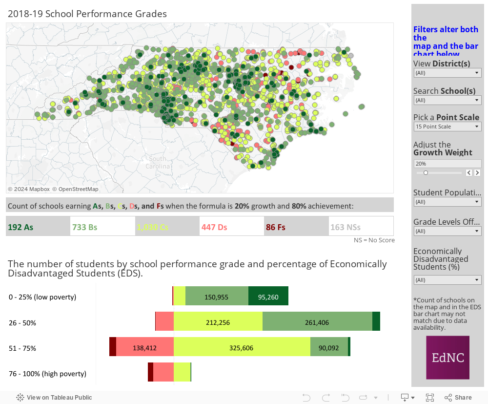
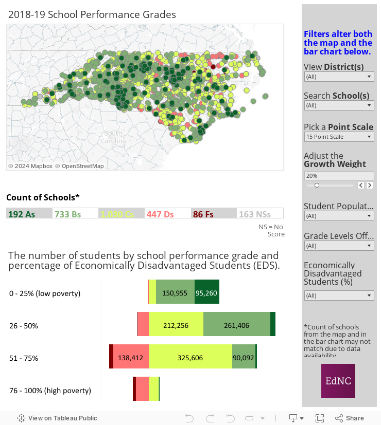
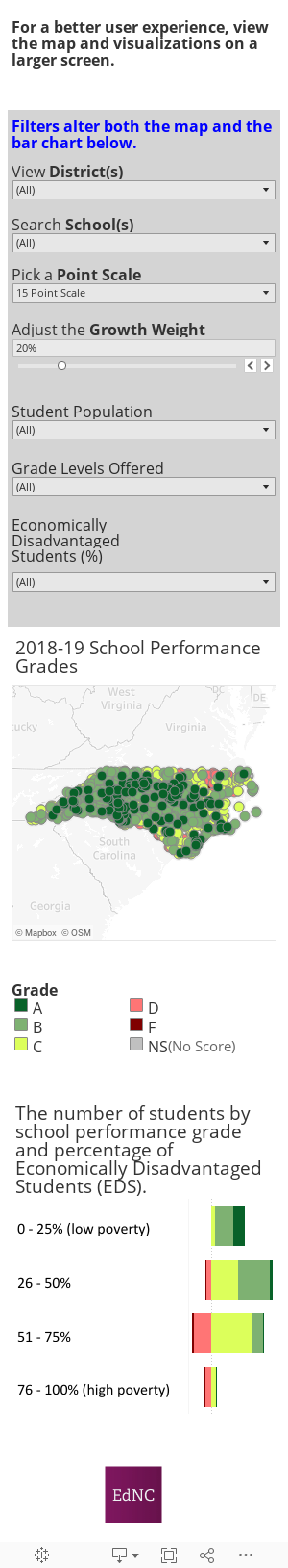
2018-19 Visualizations
This year’s visuals include familiar fixtures, like the map of all school grades and the diverging bar chart showing the number of students in schools earning each grade crossed with the percentage of needy students in each school. Users still are able to drill down to examine districts, schools, and patterns in the data based on the characteristic filters on the right side of the visualizations (or at the top if viewing the visualizations on mobile).
In addition, two analyses sparked my interest, and I decided to look into both using data visualization.
As mentioned, NC DPI included the number of days students missed for Hurricane Florence in September 2018 as a variable in this year’s data set. I was curious if there was any correlation between school grades and the number of days missed (i.e. if schools that missed more days were disadvantaged), but I didn’t find a connection, even when I separated the schools by grade level (elementary, middle, high, and other).
Second, as a geographer, I was interested in the ways in which spatial factors impact trends in data, so I examined the urbanicity of each school and how schools’ locations (either in urban, suburban, town, or rural settings) impacted school performance grades. The stacked bar chart shows the results.1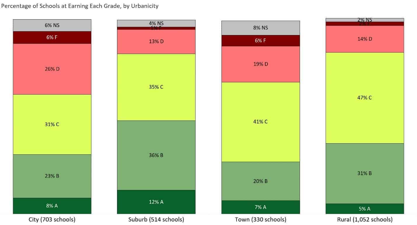
A couple of things about the bar chart struck me as interesting, though perhaps not surprising. I first observed that suburban schools earned more As and Bs than schools in other areas. A closer look revealed that schools in suburban and rural areas had the same proportion of schools earning As, Bs, and Cs (83%), followed by schools in towns (68%), and schools in urban areas (62%). While we could hypothesize as to why this might be the case, further analyses would be needed to say more for certain.
What’s next
With the debate over how schools should be evaluated constantly churning, you may be wondering what we might see in coming years. Section III of SL 2019-154 linked in the beginning of this article gives some insight into what’s next:
The State Board of Education, in consultation with the State Superintendent of Public Instruction, shall study (i) the weighting of the school achievement score and the school growth score in calculation of the overall school performance score to best reflect performance and progress for each school and (ii) the reporting methods used to meaningfully differentiate schools on the North Carolina annual school report cards. Based on its study, the State Board shall propose recommendations on whether any changes should be made to the current weighting of school achievement scores and school growth scores and how the reporting methods for school performance scores could be improved to more accurately reflect the effectiveness of each North Carolina public school.
As part of this study, it could be helpful to look at the systems other states have in place, and their reception among school leadership. This 50-State Analysis of School Accountability Systems is dated, but provides insight into the measures other states include in their school grades. According to the legislation, the State Board and the Superintendent are tasked with submitting their final report to the Joint Legislative Education Oversight Committee by mid-February 2020, and we will be watching to see what they propose. Stay tuned!
About the author